#webdev#frontend CSS Flexbox Tutorial - YouTube
- 1-D Layout Model
- Flexible and efficient layouts
Other layout modes:
- Block - For sections
- Inline - For text
- Table - 2-D Table Data
- Positioned - Explicit Positioning
Why Flexbox?
- A lot of flexibility
- Arrange items
- Spacing, Alignment, Order
Terminology
Flex Container - Container Flex Items - Child of container Flexbox Axes
- Main Axis (Left->Right)
- Cross Axis (Top->Bottom)
Flex Container
- Flex Display
- Mandatory, display: flex
- Flex Direction
- Direction in which items are placed
- Flex Wrap
- Controls wrapping of items
- Flex Flow
- Shorthand of direction and wrap
- Justify Content
- Alignment of items along main axis
- Align Items
- Alignment of items along cross axis
- Align Content
- Aligns across cross axis with multiple rows.
Flex Display
display: flex or inline-flex
- Flex (block level): Has 100% width
- Inline-Flex: Container takes width to accommodate children size
Flex Direction
Set the main axis of the flexbox
- Row (Default): L->R
- Row-Reverse: R->L
- Column: T->B
- Column-Reverse: B->T
Flex Wrap
- By default children will stay on same line, if not possible, overflow.
- For row direction wrap will make a new row.
- For column, wrap will make a new column
- nowrap (default): Will Overflow
- wrap: Wraps to the next line
- wrap-reverse: Wraps to the line above
Flex Flow
- Combination of direction and wrap
Justify Content
How items are aligned across the main axis
- flex-start (default): Beginning of main-axis
- flex-end: End of main-axis
- center: Center of main axis
- space-between: Empty space split up (none at beginning and end)
- space-around: Space in beginning and end, empty split up
- Beginning and end has 1/2 as much empty space
- space-evenly: Even empty space between every element.
Align Items
How items are aligned across the cross axis
- Stretch (default): Takes up entire cross axis (fill container)
- flex-start: Pushes items to top of cross axis
- flex-end: Pushes items to bottom of cross axis
- center: Center of cross axis
- baseline: Line upon which most text sit. Align items along content baseline, which makes the text on the same line.
Align Content
Aligns lines of content along cross axis
Mix of justify content and align items
Multiple rows must exit in the continer, otherwise no effect.
- Note: Try enabling wrapping
- stretch (default): Take up entire cross axis
- flex-start: Pushes item to top of cross axis
- flex-end: Pushes to end of cross axis
- center: Towards center of cross axis
- space-between, space-around, space-evenly
- See Justify Content
Flex Item Properties
- Order
- Order in which item appears in flex container
- Flex Grow
- Ability for item to grow
- Flex Shrink
- Ability for item to shrink
- Flex Basis
- Initial main-size of item
- Flex
- Shorthand for flex-grow, shrink, and basis
- Align-Self
- Alignment of individual flex items
Order
Control order of item appearance in flex container
- Takes a integer value.
- Default order of all items is: 0
- Layout is organized in ascending order.
Flex Grow
By default, items only take up required space to fit.
- Default: 0 (will not grow)
- Factor 1: Will grow to take up empty space
- Factor 3: Will take up 3x as much space as items of size 1
- If you set 1 to all items in a container, then they will collectively grow evenly to take up every empty space.
Flex Shrink
Ability for item to shrink if necessary
- Default: 1
- Only possible until a certain point (overflow)
- Set to 0 to disable shrinking.
- Setting to greater values allow greater shrinking factors (relative to other items)
- Example 4 will cause 4x as much shrinkage than 1.
Flex Basis
Initial size of flex item before extra space is distributed.
Used in place of "width" property in flex layout.
ALWAYS use flexbasis to set initial width of flex item.
- Can take values in %, pixels, rem, and ‘auto’
- Default: auto, width based on item content
- Sets initial size of item.
- Flex Grow and Shrink apply on top of Flex Basis
Flex
Shorthand for flex-Grow, flex-Shrink, and flex-basis
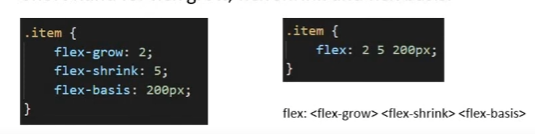
- Default:
flex: 0 1 auto;<- 0 grow, 1 shrink, auto basis.
Align-Self
Control alignment of individual flex items
- flex-start
- Item is pulled towards flex-start (cross axis)
- flex-end
- Item pulled towards flex-end (cross axis)
- center
- Item pulled towards center
- stretch
- Item stretched from cross-start to cross-end
- auto (default): Takes value from align-items property of parent container.
- Overrides align-items value of the flex-container.